This project was a mid-quarter project for my Product Design Methods class. The objective was to redesign a specific feature of an existing company. My team and I endeavored to give TripAdvisor's itinerary feature a try over 4 weeks.
Year: 2020
Role: UI/UX Designer, Project Management
Affiliation: Stanford University's ME115A Product Design Methods Class


TripAdvisor is a global travel website with user-generated content, price comparison tools, and online reservations for transportation, lodging, travel experiences, and restaurants. Users can search for services during their travel by selecting their travel dates and browsing through different categories such as Day Trips, Attractions, Food & Drink, Shopping, and more. Travelers have the option to filter their search results and read posts (reviews) written by other travelers. Like Yelp, users can also optionally leave written reviews, rate their experiences, and upload photos of their travel with each trip. From the multiple features we studied, we decided on improving the Itinerary Feature. My team and I thought we could improve this feature by making it more streamlined and user-friendly.

The users we will be targeting for this project will be university students. We selected this group of users for 2 reasons. First, according to a study done by TripAdvisor in 2016, the majority of its users (46%) were ages 18-34 while 16% were 35-54 and 38% were 55 years old or older. Second, we think that young adults have particular priorities, restrictions, and strategies that distinguishes them from a typical adult in their 30s/40s (e.g., limited budget).
For the next steps, we spent time gathering observations on the interactions between potential users and the existing TripAdvisor app. Through this step, we hoped to find a feature and area to hone in on improving. We wanted to particularly observe interactions with the following tasks: Finding a place to stay, Finding an activity to do, and Creating a trip. The observations are summarized below.
What Worked: “Likely To Sell Out” category, searching things nearby, and the users were able to list “top” attractions
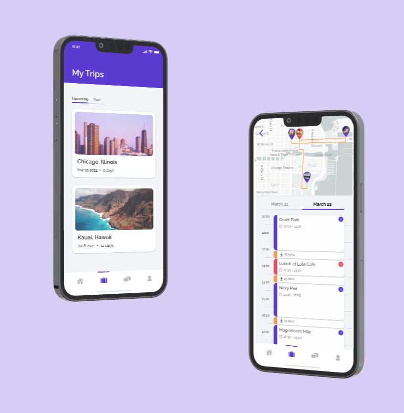
What Didn’t Work: Too much information all over the place, unclear how to navigate app, especially the “Trips” feature, and information was not displayed in a clean, digestible manner
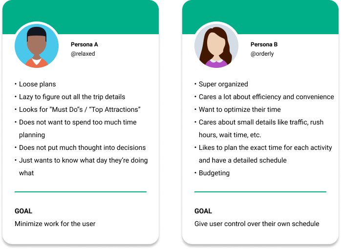
From these interviews and observations, we set forth to define our user personas as well as highlight key issues with the usability of the feature.

We continued our intitial user testing observations by organizing the usability processes for the 3 tasks (Finding a place to stay, Finding an activity to do, and Creating a trip) into task analysis flowcharts as shown below.

Task: Click on “Hotels”, Click on “Vacation Rentals”
Steps: 1.1 & 1.2
At the top of the page, the icons have clear signifiers (they label the bed icon “Hotels” and the house icon “Vacation Rentals”). However, as you scroll down the page, the navigation bar turns becomes icon-only (no descriptive text). With popular homeshare services like Airbnb, these 2 icons can be confusing since some may associate a house icon with booking a place to stay
Task: Select dates
Steps: 2.1
The calendar display highlights your travel days between check-in and check-out. Start/end dates are highlighted in a darker color, which seems to indicate that a user may be able to drag dates to adjust their days but the only physical actions recognized during this step is tapping. In addition, there is no “confirm” button. The app automatically regenerates the list of options immediately after the user selects their check-in and check-out dates, which can be annoying if you accidentally tapped on the wrong date and have to start all over again.
Previously, the 3 tasks we defined for TripAdvisor were: Finding a place to stay, Finding an activity to do, and Creating a trip. After comparing TripAdvisor to competitors such as Airbnb and Yelp, we learned that our first 2 tasks of finding lodging and activities follow similar processes. More specifically, these services allow users to filter search results, compare their top choices, make a final decision based on their personal preferences, and make a reservation. In contrast, creating a trip (in particular, planning a schedule/itinerary) was a more nuanced and complicated feature of TripAdvisor that frustrated both our team members and users when we tried to operate this task. In addition, we learned that one of the hardest parts of travel isn’t finding things to do, but rather planning each travel date such that a user can check off as items from their bucket list. We decided to narrow the scope of our project and define our system to the Creating an itinerary aspect of TripAdvisor. Since it was such a confusing feature to navigate within the app, we believe it has the most potential for improvement and creativity. The breakdown of this feature is listed in our 3 tasks below.

We decided to develop a product out more for Person B because based on the heuristic evaluations, our user wanted more control over logistics (i.e. designating time slots for activities) and optimizing time. We believe that users should be able to have more optimization features that are easily woven into the system, even if they do not desire to use all of the organizational features of the concept. Moving forward, we will incorporate some of the quick add or suggestions features of Concept A into Concept B. In this way, we can provide the organized, busy student with the tools to carefully and quickly plan their trip. From our initial stages and collective, we were able to create a fully functional Itinerary feature flow through wireframes on Figma as shown below.


This was my very first deep dive into the world of product design and it was supposed to be a part of the first few set of classes we take for our major. As someone who had only self-taught internship experience of product design, there were multiple lessons learned around providing structure to the process but also allowing for enough space for creativity. There was a balance between self-imposed constraints such as time, assumptions made about the user, and even how much energy we could each allocate to developing at each stage of the process. Regardless, it proved to be fruitful and almost necessary to have to find a sense of functionality amongst the constraints of the project. This was also my first time ever engaging and creating UI content. It would become one of the most challenging parts of this project other than having to learn things on the go and simultaneously apply them.